 If you’re like many adults in the U.S., you use your smartphone to go online – at least some of the time. A Pew Research study from last month (June 2012) found that 88 percent of adults have a cell phone of some kind. And 17 percent of cell phone owners do MOST of their online browsing using their phone… not a computer.
So, what are you doing to welcome people looking for your business through their mobile phones? Make sure you’ve thought through how people will use your website from a phone or tablet. Here are five things to make sure you do:
- Give mobile users what they want. People using cell phones may be interested in reading your blog post on the 10 best interior decorating tips for spring, but more likely, they want to find out where you’re located. Sure, they’re interested in your restaurant’s culinary philosophy, but first, they want to see menus! Don’t force people to go through your whole site to find what they want.
- Display your phone number close to the top of the page, and in plain text. If it is part of a graphic, a mobile phone won’t be able to see it. If it’s text, the phone can detect that you’re referencing a phone number, and will automatically make it a link so users can simply click to dial. Having the number close to the top makes it easy for mobile users who just want to find you and call you.
- Use simple but well-considered navigation. Don’t include too many categories (we suggest eight or fewer) that help users figure out where to go. Most important, make links easy to see. That way, mobile users browsing your site won’t struggle to figure out what information is available.
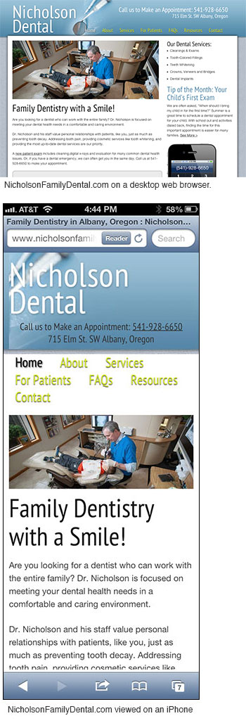
- Make your website responsive. That means that the site sizes itself automatically based on what type of device it is being viewed on. But it doesn’t just get smaller so it’s hard to read; a true responsive site will scale to be narrower and longer as it is viewed on a smaller screen. (Take a look at a site we recently finished for Nicholson Dental in Albany. View NicholsonFamilyDental.com on your desktop computer. Then check it on your smartphone. See how it works well in both?) This eliminates the need for a completely separate mobile site.
- Be easy to find in search. If a mobile user is looking for your business, make it easy for them to find you. Think of the main ways people will search for you and the terms they will use. Incorporate those in your site so you are more likely to show up in a Google or Bing search for those terms.
Need help? Want to make your site “responsive”? Contact us today using the form on the right or via phone at 541-752-9922.