Have you ever tried to find some information on a business website with no luck? Maybe it was something as simple as the phone number or hours of operation, or maybe it was something like their return policy or whether they carry a particular brand or offer a specific service. How long did you look before giving up and going to another website?
If you’re like most web users, you didn’t spend more than a minute – probably much less – clicking around and trying to find what you were after.
 Navigation and site structure are the backbone of a business website. You can hang pretty pictures on a structurally sound wall, but if the wall is falling down even the best design can’t save it. So before you start with the design piece of your new website, you’d better figure out the content and how it will be organized. Here are a few things to consider:
You’ve got two audiences. Both real people and search engine spiders are coming to your site, trying to find their way around. If either one is stymied, it will cost you. A human may go elsewhere; you’ve lost a sale. A search engine may leave all or part of your site unindexed, meaning that it won’t be listed in that search engine and when people try to find your products or services, you’ll be left out of the results.
Set up your site logically and make sure you avoid traps. We’ve seen drop-down menus that couldn’t be viewed by some humans and couldn’t be followed by search engines – no one can get beyond the home page of your site. We’ve seen sites that require registration to view parts of the site, which turns away many humans who don’t want to bother and all search engine spiders, who are not able to register. We’ve seen important content in PDF files or Flash – which, true, can be indexed by search engines, but may not be indexed well.
Make sure you’re not putting unnecessary roadblocks in the way of either humans or search engines, so they can easily look through your website.
Think flat rather than deep. Don’t hide your content under page after page of other stuff. A site that requires you to click through several layers can be necessary in complex sites, especially ones that handle e-commerce, but there are tricks for making those easier to navigate. For a standard small business website, there’s simply no need to have really deep site architecture where users have to click more than three times to get where they are going.
Instead, use flat architecture, where you have more categories but can get to any page in the site within three clicks. This isn’t a reason to have dozens of top-level navigation categories – stick with eight or nine, maximum, but organize the content underneath in a way that makes sense.
Organize your content before you design. At Visual People, we use a content planning worksheet and session to get this essential site structure mapped out at the start of a project. First, think about the main categories, or sections, of information you want to have on your site. There are some standard ones: About Us, Products, Services, Contact Us. Don’t get too fancy when naming the sections. You want them to be intuitive to users. “Products” is pretty universal; “Items We Sell” will probably get users where they want to go; “Our Stuff” is too vague.
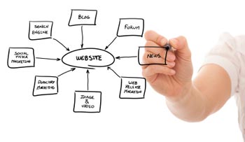
You need to think through what types of content you have on your existing site, what needs to carry over to the new site and what can be discarded, and what should be created anew. There are a number of different ways to do this step, depending on how you think: brainstorming a list of all pages, creating a mind map, making a flow chart. The key is to get everything on paper so you can begin assigning it all to a section. Don’t forget to include photos, videos, PDFs and other content besides text.
As you work, you may realize that you don’t need as many sections as you thought, or that you should add a new one. That’s much better to discover at this point in the project than when your site is almost ready to launch!
Website structure isn’t as easy as it looks, but it’s the most important part of your new website. Working with a professional will help you avoid pitfalls, but knowing your own expectations and the content you have and need will help you get the most out of your new site.