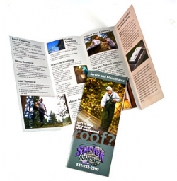
 These days, it’s common for a business to forego a sales brochure. After all, if people want to find you, they can look online, right? But there are still audiences and purposes for which a printed sales brochure can bring in lots of leads. If you are providing a service, a professional brochure that lets potential customers know what you can do for them is valuable. And a brochure for your products can spell out the benefits in a concise way that gives readers a desire to see for themselves.
Too many brochures, though, lack the visual impact or marketing message that will lead people to look twice. If you’re going to take the time to create a brochure, consider our advice:
- Use large, colorful photos of your product, service or business. One of the biggest mistakes we see is the use of lots of tiny images – or no images at all. Of course, we’re biased about the importance of professional photos in your marketing, but we do observe that people are more likely to pick up a brochure if it has nice images.
- Images should be relevant to the message. Don’t just put in a photo of your office unless it’s to encourage potential customers to come by. We won’t suggest that you never use stock photos, but used incorrectly they look fake and don’t give the right impression.
- Leave the clip art out. Rarely does clip art add anything to a brochure. Images of your product or service do much, much more to communicate to your customer than a random illustration.
- Create a compelling cover. The cover should ask a question, list a benefit, or have a headline and image that otherwise draws the reader’s attention. A company logo should be small, if it’s on the cover at all.
- Use the inside panels as a full spread. The reader will look at the inside of the brochure as a whole, so design it as a whole. Photos and headlines can go across the fold.
- Think about what you want to say, and do it in as few words as possible. Copy in brochures is tricky. Too little, and you don’t convey your message. Too much, and no one will read it. Find the right balance with strong headlines and subheads, bulleted lists, pull quotes and other smart use of eye-catching text.
- Keep your message warm and emotional, and focused on providing a solution for your reader. You just need to pull in a potential customer, and interest him or her enough to check your website or call you. You don’t need to educate about all the ins and outs of property rental or river cruises or whatever you’re selling. Just set a tone and tell the reader how you can solve a tricky problem for him or her. List the benefits of your solution. Then let the resources you’ve given for more information work.
- Include some useful information. Don’t just include sales copy. If you’re a plumber, how about “10 ways to know if you have a plumbing emergency”? Or a nonprofit might have “Five ways to make a big difference for kids” (or pets, or the elderly, or whatever group you serve). What would make you want to keep a brochure around? What could you share that would be helpful information for your target customer?
- Always include correct, readable contact info and a call to action. We’ve seen lovely brochures that left off the company’s phone number, included it in tiny type on the back or even listed it wrong. And be sure to have a goal in mind for what you want readers to do. If you’d like them to visit your website, direct them there. If you’d like them to call, offer a special for first-time customers who call you.
- Invest in professional printing. Yes, office printers do a great job. But they aren’t as good as real printing, and a reader can tell the difference. Select a heavyweight paper that feels substantial (not like copy paper) in the reader’s hands. A nice gloss or matte coating as a finish can add to the good impression.
- Don’t consider it permanent. Printing costs are lower than they have ever been. A good brochure may only work for you for a couple of months before you want to change the offer or use different photos or send a different message. Maybe what you do is seasonal – a landscape company might introduce a new brochure focused on leaf cleanup and winter preparation in early September. Don’t think of your brochure as something you’ll keep around and give out for years.
Other options, such as creating a brochure in a different shape or printing on colored paper, may work for your business. Your goal is to get the maximum amount of interest and exposure. We’d be happy to consult with you about a print brochure design, photography and/or printing – contact us with your questions.